Alisa Jane Artistry & Photography
Services
brand identity design
About the Project
Alisa Jane is an abstract artist and photographer. She has a well-traveled background and lived in Ukraine for most of her life before moving to the states.
Alisa wanted her logo to be modern, clean, and abstract.
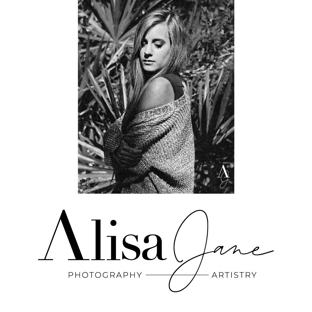
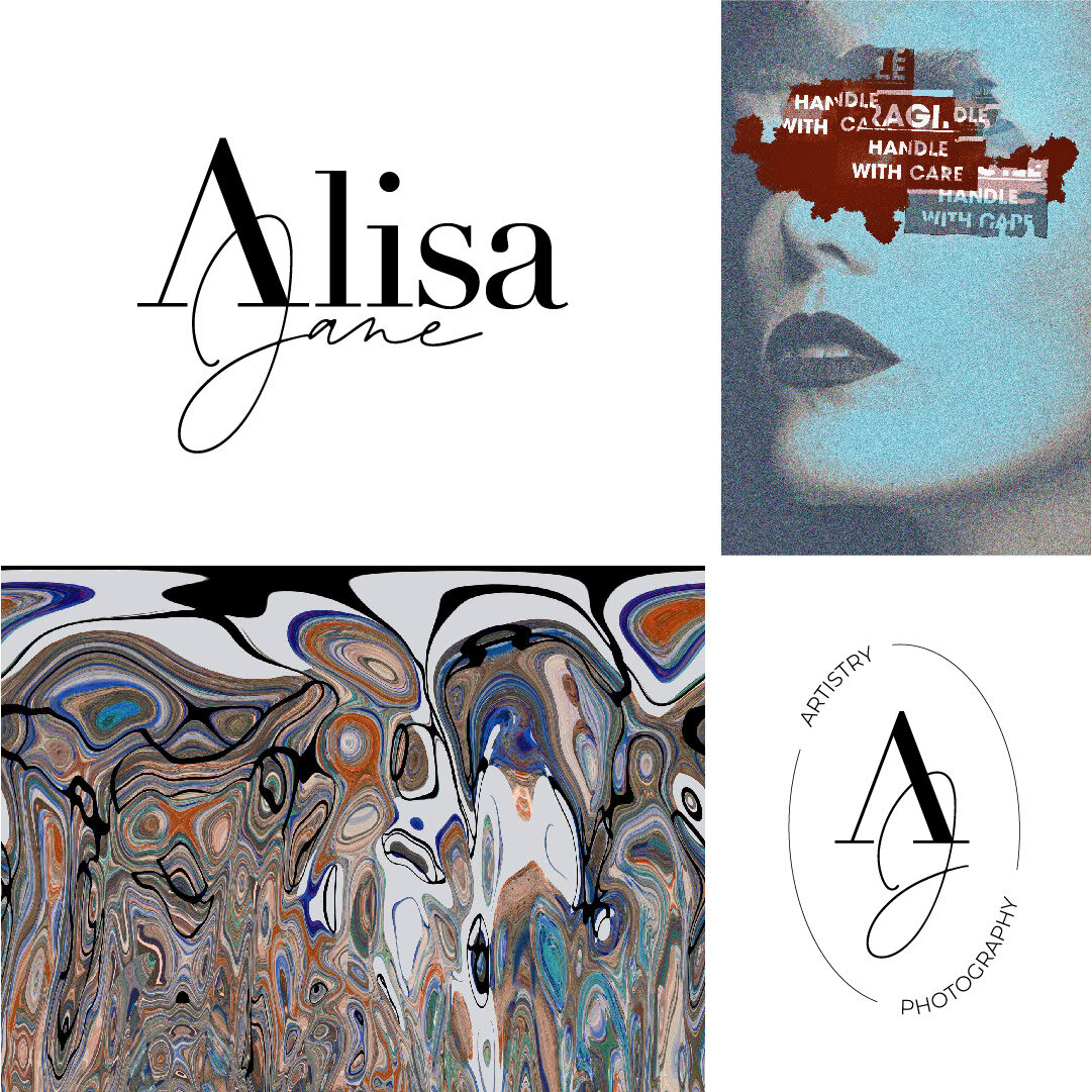
The primary logo aligns with the brand keywords by being solely typographic. A strong serif font is used in the first half of the logo with an open “A” for a modern look.
The lighter, script font in the second half provides a refined, personal touch and resembles the signature of the artist herself. The long line between “Photography” and “Artistry” doubles as a faux signature line.
Both submarks use a creative, simplistic combination of Alisa Jane’s initials “AJ,” considering it’s a personal brand. The secondary submark displays Alisa Jane’s services in an oval curvature to reflect a portrait.
The color selection includes a deep, cool red, drawing from the brand’s mood board depicting Ukrainian fashion, to add dimension and a dose of “abstract” to the brand color palette.


