7 Different Types of Logos Used in Brand Design (Explained)
When it comes to logo design, the options seem endless. The best-known brands use a variety of logotypes, and each is successful in its own rights. Choosing a brand design that works best for your business can seem overwhelming when faced with a slew of aesthetic options.
In this blog, I explain the seven different types of logos (with examples) used in brand design.
First, let's set the groundwork by answering the question: What is a logo?
What is a logo?
In short, a logo is a graphic mark, symbol, text, or a combination of the three used to identify a particular company's products or services.
What makes a logo good?
What makes a logo design great? An effective logo has five qualities:
Simple
Some of the world's most popular brands are incredibly simple. Think of Apple or the Nike swoosh. Simple logos are easy to recognize and concisely highlight a brand's personality without all the extra fluff.
Memorable
A great logo creates a connection with its audience from the moment someone sees it. If a consumer can easily recall a brand's logo, then they've done a successful job in making their design memorable.
Timeless
The best logos are those that are timeless because they remain relevant over time. It's tempting to lean towards trendy logo designs, but you're almost securing the need for a new logo within five years. Timeless logos are simple and use a color palette that won't go out of style.
Versatile
One size does not fit all. Every brand should have at least four logo variations: primary logo, secondary logo, submark, and a favicon. Logo variations ensure your brand can be easily recognized when scaled or shrunk down.
Relevant
Logos need to be relevant so that they create a connection with their target audience. Relevant logos have distinct personalities that are identifiable from other brands. Fonts, in particular, help communicate a brand's personality, but that's a blog for another time.
In some ways, every brand is a combination of text and graphics. But, each one creates a different feel in the hearts of consumers.
Now, let's dive into the seven different types of logos (with their names) that you need to know before starting your branding journey.
What are the 7 types of logos?
1. Emblem logos
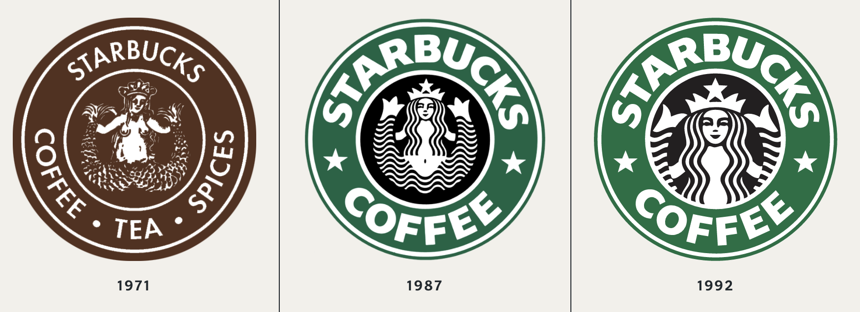
An emblem logo tends to look most traditional. Think of a stamp, badge, or seal. While "traditional" might sound like "outdated," they are classic and typically timeless. However, some companies have modernized their emblem logo designs, such as Starbucks, to make them more current.
Due to their intricacies, emblem logos are probably the least versatile of all of the logotypes. But, they are incredibly memorable and form a loyal customer following.
Think of bikers who proudly flaunt their Harley-Davidson gear or the prestige that comes with rolling up in a BMW.
Emblem logos have an attractiveness that tends to create die-hard brand ambassadors.
2. Lettermark logos (Monograms)
Lettermark logos usually consist of the brand's initials. Think IBM, HP, CNN, etc. Lettermarks (AKA monograms) are a great option for businesses with long names that want to have a concise logo. Logos that only use letters are called typography-based logos and air on the side of simplicity (which we champion at selah creative co.!)
Think about it, how much easier is it to say "HP" than remembering the name Hewlett-Packard or saying the "National Aeronautics and Space Administration" instead of NASA?
3. Wordmark logos (Logotypes)
Wordmark logos are similar to lettermarks, but instead of being acronyms, they spell out the full business name using a distinct typeface without a graphic element (e.g., Google, Visa, Coca-Cola).
Google's logo is a great example of a memorable wordmark. It hits all five points of a good logo design. The design uses a simple sans serif font and timeless colors, creating strong brand recognition.
Because the focus is on typography, a brand's font choice is crucial for both lettermark and wordmark logos. When I rebranded selah creative co., I decided to go with a wordmark logo, too, because I believe in the lasting power of a strong typography selection.
4. Pictorial mark (Brandmarks)
A pictorial mark, also called a brandmark, is a graphics-based logo design. When you think "logo," it's likely what comes to mind. For instance, without seeing the name "Apple," you could see the pictorial logo of an Apple—designed by Rob Janoff—and know it's an Apple computer product.
Or, if all you saw was a red and white bullseye, you'd likely know it's Target without seeing the store name. Brandmarks are simple but strong logos that tie a specific icon that's relevant to your brand name.
5. Abstract logo mark
Abstract logos are similar to brandmarks. However, instead of using a literal icon or object relevant to your brand, abstract logos use a unique symbol created exclusively for your brand. Nike is a great example of an abstract logomark.
These logotypes don't mimic any real-life object. Instead, they use creative liberty to express a specific aspect of your brand. Abstract logo marks are very recognizable and are typically seen in combination with the business name (e.g., Airbnb, Microsoft, Adidas).
6. Mascot logos
Mascot logos are endearing and certainly memorable. Mascots are images of a character that personifies your brand. My favorite mascot logo is Mailchimp's winking monkey, Freddie. Many food businesses tend to use mascot logos (e.g., Pringles, Pillsbury, and KFC) because they're family-friendly.
Mascot logos are not a good fit for all business models because they tend to be geared towards kids, but they are great at humanizing brands.
7. Combination mark
Combination marks merge a logotype (word-based logo) with a logomark (image-based logo). Meaning they use both the brand name and an image in their design.
For instance, Mailchimp's mascot logo is also a combination mark because it uses the brand name and Freddie the monkey as its icon. Likewise, Squarespace's logo is a combination mark because it uses the abstract square icon with its brand name.
Combination marks are the most versatile logo designs because they can use the brand name and icon together or separately.
At Selah Creative Co., we prefer a mixture of lettermark and wordmark logos because we believe selecting a strong typeface to represent your brand is timeless. Most brands use logo variations to dip in and out of the seven logotypes, giving their design(s) more flexibility, but there is usually one logo that’s the primary “face” of the brand.
Interested in connecting with a brand designer to elevate your look online? Let’s get in touch.


