How to Choose Your Brand Color Palette
Have you ever wondered how to find the "right" color combination, but haven't had any luck scrolling through pages of Pinterest inspirations? Well, I've got a simple framework for you to follow!
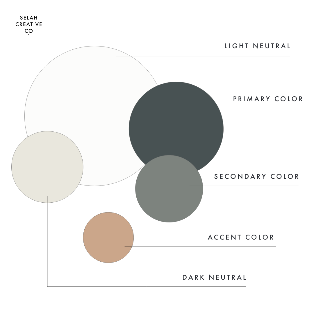
Every brand needs five base colors to set the foundation of its color palette.
The 5 Colors Every Brand Needs
You can expand these colors into various shades of each color to create more versatility, but these are the basic colors every brand needs.
01. Light neutral
Every brand needs a neutral like every woman needs a nude pair of pumps. A light neutral works great as a background color, and balances out the bolder colors when white is too boring or needs a break.
02. Primary color
Your brand’s primary color will be the star of the show. Use it liberally in all of your brand collateral (digital and print). Try to select photos that also include this color to use on social media for an on-brand feed.
03. Secondary color
Secondary colors blend in and complement your primary brand color without taking center stage (like a best friend). The easiest way to choose a secondary color is to take your primary color a shade or two lighter or darker.
04. Accent color
Your accent color is the pop that brings your brand to life! Use it to highlight calls to action (e.g., “Contact Us” buttons), important information, or creative brand elements. Accent colors are the most pronounced of your brand colors.
05. Dark neutral
Darker neutrals give your palette more versatility and usually work well as a font color if they’re significantly darker (which is not the case for the color palette above).
And there you have it! Straightforward and to the point: the five colors every brand needs to complete their color palette. Happy swatching!

